
Redesigning experience addressing unhappy paths - Auckland Council Webpage Experience Redesign
Role: Agile UX Design Candidate | November 2022 | Duration: 2 days | Tools: Figma
The Work: I was given an assignment to redesign the Auckland Council's dedicated page to book an inorganic collection during my "Certification in Digital Technology Product Solutions - Agile User Experience Design" in Mission Ready HQ, Auckland, NZ.
Task and Scenario: Auckland council approached for advice from the UX designers to redesign a dedicated page to book an inorganic collection.
The challenge: Analyze and organize the thoughts with a in minimal time without following any design process and. I was also introduced to some fast sketching methods like "crazy 8".
The problem given: The page has so much information it can sometimes be difficult to find out how the inorganic collection works. The customers must click through all the different sections and spend valuable time rummaging through a cluster of information to book an inorganic collection
The Process
I created my own process to design in minimal time.
-
To understand the problem, I chose to research from the generic customer journey mapping and find out the pain points.
-
From that pain points I validate some of the opportunities
-
Then I tried different sketches for the sections and the page
-
Tried to finalize the better one
-
Created the better one's hi fidelity wireframe and simple prototype
Discover - Understand
Why and What should I redesign?
My process starts with understanding the problem with some questions. Why the council wants to redesign that page? What is wrong in that? Where the user finds it is taking long time? I also keep in mind the council’s information are crucial and I cannot reduce them because that may lead to lots of enquiries. I did the following research:
-
What is in the current website
-
Current user journey / flow
-
Finding the pain points
-
Sort out opportunities
I wrote down all the information the page has, the sections, the links and I also did the current user journey to travel and understand what and where the user miss information and takes time.
I made “why” questions to organize my thoughts and how I can solve those problems. I used the Abstraction laddering of Google's Design Sprint Methodology.

My initial ideas to fix those issues were:
-
Improving the visual hierarchy
-
Using illustrations or images to explain the facts (rather than using a long text, I thought it would be easier to grab attention and reduce cognitive load)
-
Organising and grouping the scattered contents
But my ideas kept evolving at every stage.
Generic Customer Journey Mapping - Current webpage

From the current user journey, I can find that some places lead to booking, and the user may miss some of the important information without noticing them. They may miss some alternative ways or a relevant category. This may lead to false or invalid booking. That became my main goal - to help the user and the council from invalid bookings as they take both of their valuable time.
"The best products don't focus on features, they focus on clarity." - Jon Bolt, UX Designer and Writer
My idea is prevent the maximum negative experience / errors that leads the good experience. In simple words, Before making the happy user journeys, address the unhappy journeys.
I noted some of my opportunities from the pain points I found in the current journey.
Ideate - Addressing Unhappy Paths
I started to organise my ideas from different user perspectives. I created three user stories using the services of the council.
User Stories
-
As an Aucklander, I have 5 old bean bags and a few tires to dispose (Unfortunately, all his items are not acceptable), I am confused whether I have accepted items, I want to confirm them before booking, so that I prevent false booking and wasting time.
-
As the resident of an apartment, they want to dispose an inorganic collection at the same time, so that they can reduce multiple individual booking. (They can choose the bulk booking rather single booking for everyone)
-
As an Aucklander who misses the last inorganic collection, I move to Wellington next week, I want to move my unwanted inorganic stuffs in an alternative way, so that I can dispose the items before I move. (He needs an alternative way to dispose his items)
Fortunately, the council’s dedicated page has all the information. But they are hidden inside some paragraphs. Most of the users have a chance to go to the single online booking because the page has many links to take them there.
Grouping and Organizing


I grouped the sections into 3 categories,
-
Understand whether it is an acceptable item
-
Understand how inorganic collection work
-
Understand what the type of collection are
I started to sketch a few of my ideas and started designing my new user flow. I chose not to change some of the website elements (Pdf download, Is this helpful question, related articles, footer) as it doesn’t give any issue in the flow. I also decided not to change any of the page brand as it may miss the website consistency.
The next stage of my ideation: I carefully ideated my assumptions fit into the desirable, viable and feasible circles (Assumption mapping method from Google's Design Sprint Methodology). How this is related with this project:
Desirable: Do they want this? - What should be prioritized? and how that is helpful with avoid false booking and encourage valid booking?
Viable: Should we do that? - How it could save the time? How it could reduce the current problem?
Feasible: Can we do that? - Can my design easily fit into the current design system. If I introduce any new style of components, is it responsive?
I chose some of the component’s styles from the other pages of the council’s website for my new sections to maintain the consistency.


My new user flow
My new user journey is quite simple,
-
Whether they have the accepted item
-
Understand how it works
-
See the released schedule
-
Choose the type of collection
-
Proceed to booking


Sketches
Version 1&2 - Prioritising
My first version was simply arranging all my ideas. I was thinking about which one I should prioritize. Thinking from another perspective, which is more important and should be seen before booking. I decided to go with the acceptable item information at the top. And think from the new resident to NZ, they must know how it works before booking, so I move the “How it works” section next.


Crazy 8 methods
I applied crazy 8 methods for different sections to conclude on which one would be the best idea.

In the above picture I chose the idea 5(top right corner). I could see my ideas were evolving and reached the best at the end. I chose idea5 because I thought the removing the accordions would save time as it doesn’t have much content inside. So, I chose to use cards. And I think I shall give the alternative booking at the end because we cannot encourage everyone for the alternative booking upfront. Auckland has only a few apartments compared to individual homes, so the need for the bulk collection might be less. So, I chose that to be in the second place.
My other crazy 8 sketches:


Version3
After finalising the ideas from the crazy 8 methods, I created my desktop and mobile screen sketches.


But in that design, I thought from the existing user of the website, I felt it may be frustrating for them to scroll longer to reach booking. I organised the top part and decided to use accordion. That leads to Version 4 of my design which gave a minimal look with all the relevant information.
Version 4
I felt the version 4 has a smaller page with all the contents and has the less scrolling time. So, I finalize this one. I also carefully crafted the mobile version and arrange all the components properly.


Proposed Solution
The wireframes were created using Figma.
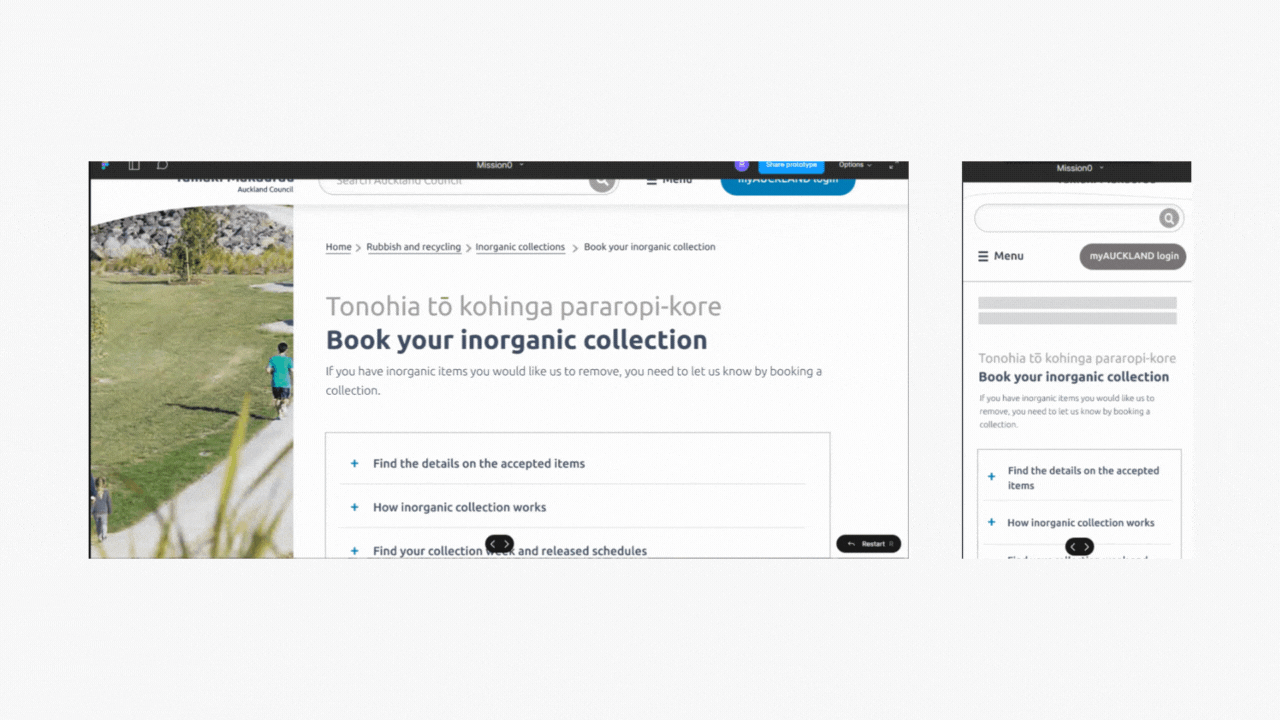
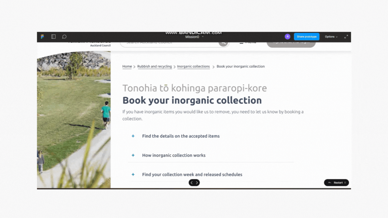
Comparing my ideas with current site -
Design rationale
Accepted items must be known before they start their booking journey. The website has the information hidden in paragraphs and the user may get diverted and book the collection before they know whether they have the acceptable items.


I used some illustrations and grouping in some places to reduce the cognitive load and grab the user’s attention.


Conclusion
A UX Designer can see the problem in different directions and think about different scenarios. In my work, I added more emphasis on whether the user really needs a booking (In my first user story the user has all their items, are not acceptable.) and what booking they need (In the second user story they need to book a bulk collection. Bulk / Single - both have different paths to booking).
From a client's perspective, I also concentrated on giving all the exact information the Auckland Council wants to give the user because it is so crucial and missing it may lead to more enquiry calls to the council.
From a user's perspective, they need to know what the acceptable items are before they get to the booking stage. It may save time from false booking.