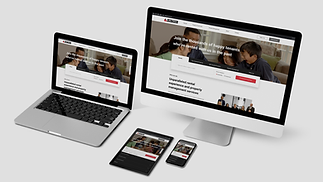
Designing new rental experience - Problem Solving, UI Design, Developer Hand Off & NN Heuristic Approach - Metro NZ Property Management
Role: Agile UX Designer | Timeline: December 2022 - January 2023 (4 weeks) | Tools: Figma, Miro, Azure DevOps, Trello, FigJam and Teams | Agile Methodologies: Scrum
The work: I was given a design challenge to create the new rental experience for the Metro NZ Property Management, Auckland during my "Certification in Digital Technology Product Solutions - Agile User Experience Design" in Mission Ready HQ, Auckland, NZ.
The Challenge: Metro NZ Property Management Ltd is a one-stop rental property management company. During the Auckland COVID-19 lockdown, Mary, a newly promoted personal banker in her mid-thirties, uses the Metro NZ Property Management website to search for a two-bedroom property. By taking the customers' feedback into consideration.
-
Redesigning its home page
-
Search page and feature pages
The Team: We teamed up as a squad (two designers and 2 developers) and followed the Agile Scrum methodology to manage the project.
Team mates' Endorsements: "Rameez had excellent leadership skills as she managed all the meetings successfully and encouraged every team member to participate and share their opinions. Moreover, she loves accepting challenges and quickly adapts to the new problem. I still remember she took the initiative to provide responsive design for mobile and tablet devices. She successfully managed to provide a responsive design at a minimal time value. Rameez will adapt to the company culture and be a valuable asset to the company." - Karan Singh, Full Stock Developer
"She was able to cooperate efficiently, and she delivered well-designed layout and structure. She was very cooperative and always clarified her design and looked for improvement. Apart from her excellent work performance, she is a supportive and kind person. She will definitely be a good asset to the company!" - Phoebe Su, Full Stock Developer
The Scope
Problems I chose to solve,
After the UX research, we (Design Team - My design mate and I) found a few problem groups to solve to improve Metro's rental experience. We shared these problems to work on our own space. But we kept meeting to give peer reviews to improvise our solutions.
Problems I chose to solve,
-
Lack of structure on the home page & unclear information architecture in the menu
-
Unclear information about rental process and services
-
Lack of options for keeping records and tracking processes
Design Thinking Process
We followed 4 steps of the design thinking process - Double Diamond Approach. The methods I used at every step, Here I explain the Develop and some of Deliver Phase while solving the problems.
.jpg)
What I explain in this case study,
In this case study, I explain my problem solving, responsive UI design, NN heuristic approaches and the prototype.
I explain my Agile Project Management, collaboration experience within squad (developers and designers) , UX Research, the three level usability testing and Ethical decision making principles in my another case study for this project. Check out my case study on Agile project management, Research & Testing.
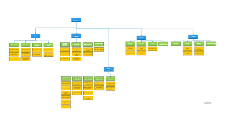
Organizing IA
The Problem: Lack of structure on the home page & unclear information architecture in the menu
The problem statement helped to define the business perspectives and objectives of the problem, while the user story helped to define the user perspectives and objectives of the problem. I created a separate problem statement, user story, acceptance criteria and DOD for each problem.
Problem Statement
“The process of finding rental information on the home page is too complex. This means finding rentals through Metro often takes a long time. There’s an opportunity to organize their services on the home page and menu that might help the customer to find rentals easily and also consider the property management service and, thus, it improves the number of customers.”
User Story
“As a newly promoted personal banker (who is so busy), I want to find the property management's rental services from the wide range of Metro services easier and faster, so that I can proceed to find rentals in Metro without any confusion.”
This problem statement and the user story I created to address the following customer feedback that mentioned in the challenge. “The home page is too noisy. I don’t know where to start.” “The services are loaded with too much information. I don’t feel like reading it.”
Acceptance Criteria
-
The user can see the rental services in the first place. (on the menu and on the page)
-
The user can see the rental property listing button on the home page.
-
The user can have the link to the rental process from the home page
-
The service for tenants is clear and concise with links to property listings
-
The user can differentiate all Metro's clients and Metro's services.
-
The user can see the contact details clearly
-
The user can see the clear IA on the home page
Definition Of Done
The user must be able to find the property management's rental services from the wide range of Metro services easier and faster and proceed to find rentals in Metro without any confusion.
How I solved this problem,
-
I tried to organize the IA of the website before starting layouts, as I found the menu is the first place the user wants to look in from my previous research on this project(CJM and empathy map).
-
I decided to give the search box in the home page to improve the efficiency.
-
I decided to maintain the balance of all service information that is missing on the home page that I found during the UX Research.
Organizing the IA was the most challenging one when I started to sort it out. I started to organize only from Mary's perceptions. It doesn't work :(
.jpg)

Then I tried How and Why Laddering to deep dive into the problem. From there, I found the organizing and grouping must be done for all the information. Once I figured it out, I reached my solution easily.
I gathered all the information from the whole website and started to categorize them into different groups.
-
Grouped by services they offer (Rentals, Investments, Management services)
-
Grouped by the customer roles (Property owners, Tenants)
-
Grouped by the trade, people do with Metro (Finding Rentals, Selling, Buying, Managing)
I decided not to consider using services like the current version as it has fewer categories when compared to other groupings, as it would become higher level, the user might need to search for a long time in the categories when compare to other groups.
To improve my IA, I experimented with various versions and gathered feedback from my team members. Their suggestions were valuable, especially regarding the importance of using a clear tone of voice in menu labels and understand their different perceptions. This feedback has enabled me to enhance the user experience and make the information more accessible.
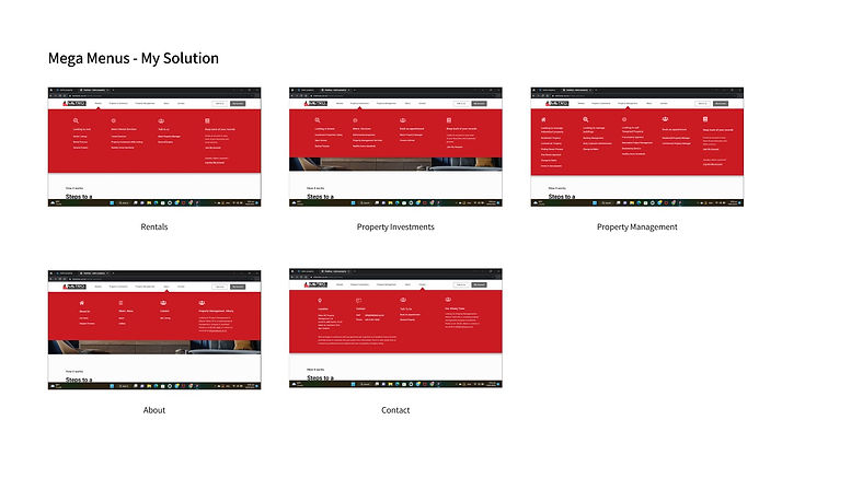
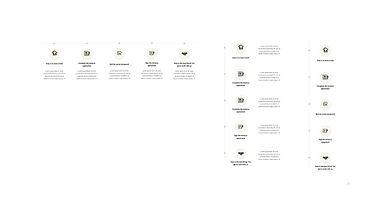
Main Navigation - Service Categories
For top navigation, I used the service categories. I also included two more options, i.e., About and Contact, because during research I got insights about what are the things the people look for in the navigation bar.
Why I designed Mega Menu,
I again categorized into the smaller groups what are the possible interactions that could be done within the particular services. I also think about adding the options for what are the possible cross-selling between these services. For example, the person who comes to sell property can also view the gateway to buying new property.
.jpg)
.jpg)
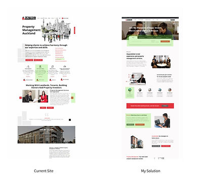
Comparing my solution with the current site
I gave only one action for the navigation items, i.e., when you click, it will just open the mega menu, not other pages. The current site gives two actions. While hovering the menu opens and while clicking it moves to other page. While collecting different insights during my research, I noticed many people missed the action of going to the new page as they first saw the hovering action.
As my grouping structure expanded, the services, so when compared to the current site, the user can find rentals or other services in the first place without clicking anything.
.jpg)
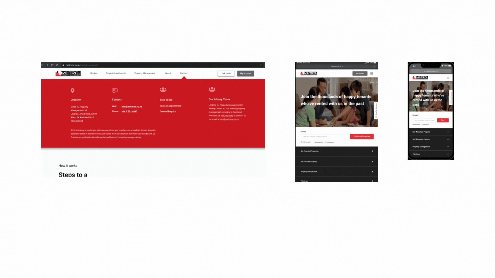
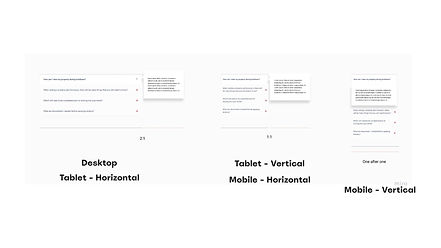
Is my solution technically feasible to be responsive in different view ports?
Whenever I created the components, I always care for different view ports because that feasibility makes the UX complete. In Tablet vertical and Mobile, I used accordions to show the menu items under headings. Like the desktop menu, I just used one action on every item.
Information Architecture
I carefully crafted the IA on every menu page by considering
-
Cross-selling in between services
-
Simplifying the journey by giving possible gateways for every services (to improve efficiency)
-
Try to make never-ending journeys to make the user spend more time on the website
.jpg)
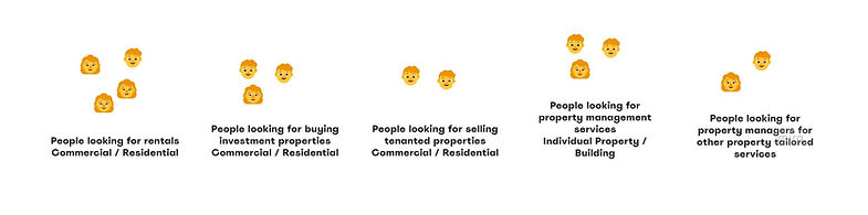
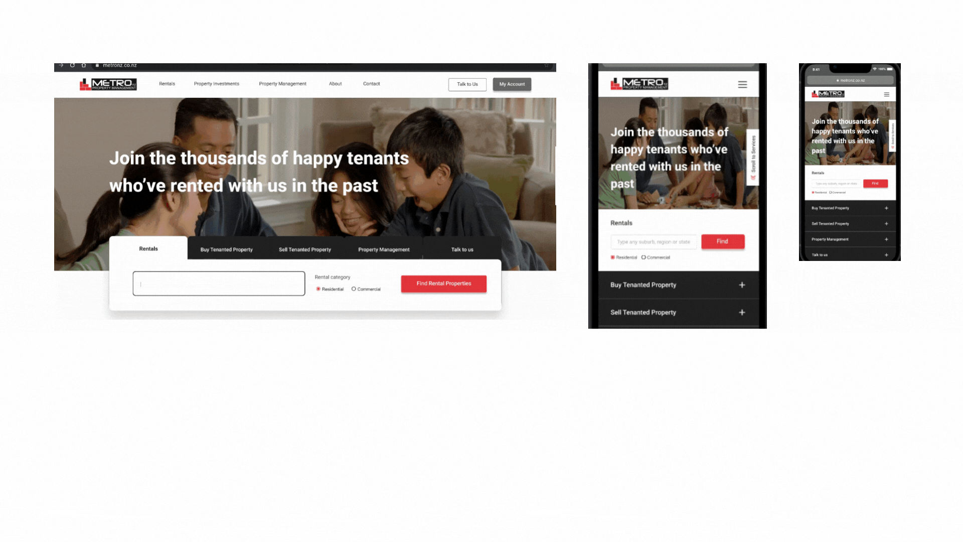
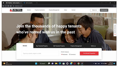
Home Page Structure - The search box
For the search box, I categorized possible user groups and their actions, who might come into the home page. Initially, I just used rentals and investments, but I tried to make it more personalized. Then, I came up with these groups.
For every category, I gave personalization filters for the users to improve the efficiency of the product and give them personalized results before they move to the next page. For example, while looking for rentals, they can filter whether they are looking for residential or commercial.
.jpg)
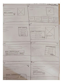
Crazy 8 Sketches
Initially, I used the crazy 8 sketches method for home page header as I thought it was the important component and the first place the user sees while entering the website. I chose my sketch7 because I thought I could give the search box options with a few personalization filters that could give a personalized results from the first screen.
Once I got this idea, I again went back to research and tried to add most possible user groups to come to the home page and refine my design and also it kept evolving during the wireframe stage and testing. And I also tried to give personalization on every tab.
.jpg)
Is my solution technically feasible to be responsive in different view ports?
I used adaptive design on this particular component i.e., I used another style of component for mobile and tablet.
Why I chose Adoptive design,
I have seen some competitors who used this search box, use a sliding sideways responsive design and also hide some filters when using mobile. I chose adaptive design because, I wanted to show the user all the possible gateways in the first place.
.jpg)
Metro Pages' Structures - Ideate Through Various Experience Pillars
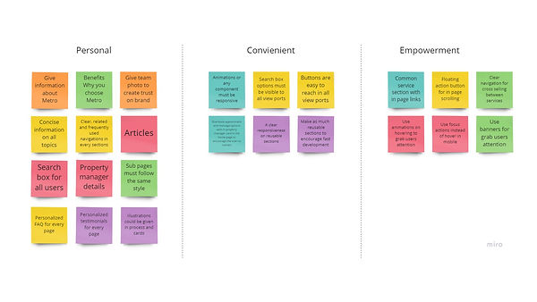
Once I sorted out the IA and main categories, the layout of the other pages become easier. I started to think about various experience pillars to give the pages a good user experience.
The product's pages need to fulfill these user needs.
Personal : Contains all the relevant information that is easy to achieve that helps the clients' objectives
Convenient : Clear response through mobile and desktop
Empowering : Clearly organizing the information architecture for the user to find the information quickly.
.jpg)
Home Page Structuring
The problem I found on the current site is a few elements about rentals and that's also hidden inside some sections.
With the help of research through various experience pillars, I can find some more ideas to make the page efficient, responsive and have more user control and freedom.
In my solution, I solve this problem by giving equal weight to all customer groups. In testing, this flow is passed in the first level of testing. All my testers were able to find the rental information on the home page within a few seconds. Hence, the problem is solved!
.jpg)
.jpg)
Designing Static Pages
The Problem: Unclear information about rental process and services
Problem Statement
“The process of understanding a company's renting process, tenant services and finding company's reputation among tenants is too difficult. This means considering the property management service often takes a long time. There’s an opportunity to help the customer to understand the rental process and services that might help the customer to build confidence and create trust in the company, and to make the decision to consider the property management service and, thus, it improves the number of customers.”
User Story
“As a newly promoted personal banker (who is so busy), I want to understand the renting process, tenant services and property management's reputation among tenants easier and quicker, so that I can trust and consider that property management service for my rental.”
This problem statement and the user story I created to address the following customer feedback that mentioned in the challenge. “I would like to search around before I decide to be a tenant. The tenancy application button sounds like I have to make a commitment.” “I would like to see a clear process or steps to rent a property"
Acceptance Criteria
-
Exclusive pages for rental process and tenant services
-
The dedicated tenants page and rental process should have a FAQ section for current tenants and tenants to be.
-
Both pages should have testimonials from tenants and customers experiences during lock down.
-
The renting process should be explained as an illustration on the rental process page
-
There should be an explanation of Metro Account portal and link for Sign In or register on both pages
-
There should be some property listings for sale and rent and link to property listing page on both pages
-
The subpages should have links for upselling
Definition Of Done
The user must be able to understand the renting process, tenant services clearly and consider Metro NZ Property Management for their rentals.
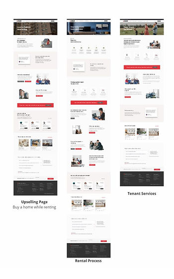
Information about rental process and services
The rental process and tenant services were explained in exclusive pages with clear navigation. In testing, users were able to find the rental process and understand it in the first place. Hence the problem is solved.
Considering Mary's mental state being in lock down, I also give the user information about how Metro works in lock down, how Metro was successful in the remote work.
For cross-selling gateways, they were given in attractive banners. And I also created a page for "Buy A Home While Renting" to attract the people looking for rentals towards buying an investment property.
It is another challenge that Metro only sells tenanted properties. Considering Mary is hoping to buy her first house in two years, I arranged the contents in cross-selling page to convince her to buy a tenanted property while renting. I gave personalized testimonials and FAQ to improve her confidence in buying an investment property while renting.
.jpg)
.jpg)
Is my solution technically feasible to be responsive in different view ports?
The components I made for every page are a pixel clear components and responsive to every view port. I often got peer review from our developers about the technical constraints of the components I created. Some of the components I made for these static pages.
.jpg)
Design A Property Management Metaverse Portal
The Problem: Lack of options for keeping records and tracking processes
Problem Statement
“The process of keeping track of all records and the processes requires manual activities and getting help in person during lock down is limited. This means keeping track of the renting process and getting assistance from the property management has become too difficult for the customer. There is an opportunity to keep all their records and communication in a comfortable space that might help the customer to handle all their rental processes and get assistance remotely and, thus, it improves customer satisfaction and business in the company."
User Story
“As a newly promoted personal banker (who is so busy and also in COVID 19 pandemic), I want to keep all my records in one place and also get assistance from the property manager throughout the process remotely, so that I can successfully handle the renting process remotely during the lockdown .”
Acceptance Criteria
-
There should be a portal menu for keeping track of records.
-
The user can see their favorite properties
-
The user can see all their process status
-
The user can apply for a tenancy application from that portal dashboard
-
The user can withdraw their application from portal dashboard
-
There should be an automatic cancellation in case the user committed and signed to the particular property (edge case scenario)
-
The tenant can raise a request for maintenance after renting (Nice to have after tenancy)
-
The user can upload their documents for account check and character check.
-
The user can pay through the portal.(Nice to have after tenancy)
-
The user can get remote assistance through messages at every stage
-
The user can book and contact the property manager through video calls
-
My applications and favorites can be used even after a successful renting
Definition Of Done
The user must be able to handle the renting process remotely during the lockdown.
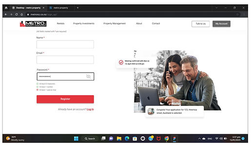
Creating Portal Structure - A Property Management Metaverse
I created a property management portal to efficiently store and track records. The goal was to develop a solution that addresses individual needs without creating problems for others, so I took a holistic approach.
The result is a metaverse - a digital space where landlords, tenants, and property managers can communicate and interact through online profiles. This virtual environment replicates the physical world of real estate, providing a platform for property management tasks such as rent payments, maintenance requests, and lease agreements. The portal can be accessed via computer or mobile device, enabling real-time communication and collaboration for the management of properties.
-
I designed a generic portal called "My Account Portal" for first-time users based on my comprehensive understanding of Metro services and my cross-selling plans. This portal provides a one-stop-shop for users to access both rental and investment favorites.
-
As users engage in trades with Metro, their portal will be upgraded to a "Customer Portal" with features specific to their role. For example, once Mary becomes a tenant, she will have access to online payments and maintenance requests in addition to generic pages to assist with investments or new rentals.
-
To complete the portal structure, I also created a "Property Manager Portal" for property managers.
-
The portal structure is designed with a conditional menu to allow for easy access to all static pages on the website, improving efficiency for users at any stage of their journey.
.jpg)
Future State Of Portal
The blue colour pages are generic and the green colour pages are the upgraded pages and unique ones for every customer role. While the tenant has a feature of online payment, the property owner will have the My income page.
How it works in back end
When Mary send viewing request to property manager. The property manage will receive the message in their portal. Once they accept, Mary will receive confirmation in their portal and mail box. I also designed a built in message application with in the portal to keep all their communication in one place.
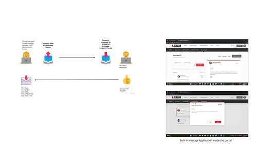.jpg)
.jpg)
My Account Features and Peer Reviews
Once I created the complete structure, I designed only the possible pages Mary can travel while renting. I created the My Account portal with these features.
-
Saving Applications and tracking them
-
Saving Favorites
-
Keeping track of communication
During the designer peer review, I confirmed all the possible channels that come from her designs. I also created gateway to that. Example, seeing draft applications, Apply button to application process
During the developer peer review I was asked about responsive aspects. I also explained my design flow and I handed over all the flow of sign up and log in screens and the new user and the existing users' experience in My Portal.
The testing plays a major role on reiterating design solutions for these problems. Check out my Case Study on Research and Testing to find out my 3 level testing for my solutions.
.jpg)
.png)
.jpg)
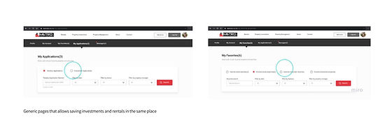
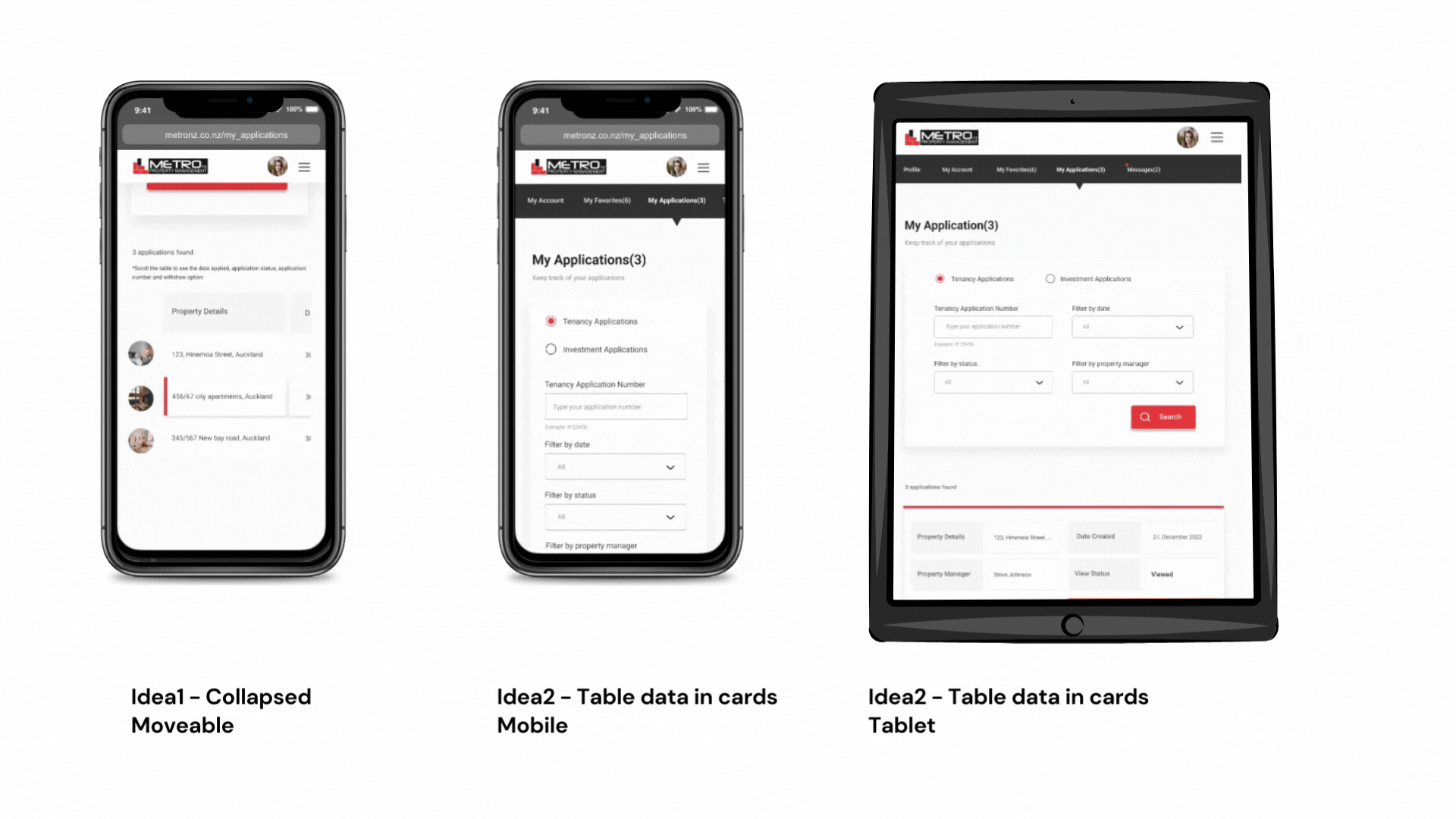
Tables in Responsive Design
The table for data shown in My Applications and My Favorites are designed to be fully responsive to different view ports. Initially, I designed the moveable collapsed tables for smaller screens. But it kept hiding the details from the users. So I designed cards for showing the data in the tables. I checked with my developers about the feasibility of creating these adaptive designs and finalized my idea 2.
3 Level Testing
The testing played a major role on reiterating and conclude the design solutions for these problems. Check out my Case Study on Research & Usability Testing to find out my 3 level testing for my solutions.
Some Of my sketches and Interaction Designs
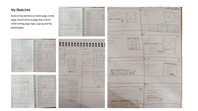.jpg)

Design System
My contributions to our component library / Design System
I developed a set of design elements(design atoms, molecules), such as buttons in various states, check boxes, radio buttons, icons, labels, and others, which I then incorporated into responsive menu components(organisms), pop ups, FAQ and testimonial sections(templates), animation components, footer sections, cards, and drop-down menus. My design partner and I shared these components from our library. Some of my specific contributions include using consistent imagery, such as black and white backgrounds with colored people, and maintaining brand consistency through the use of the same brand colors and hues.
.jpg)
.jpg)
.jpg)
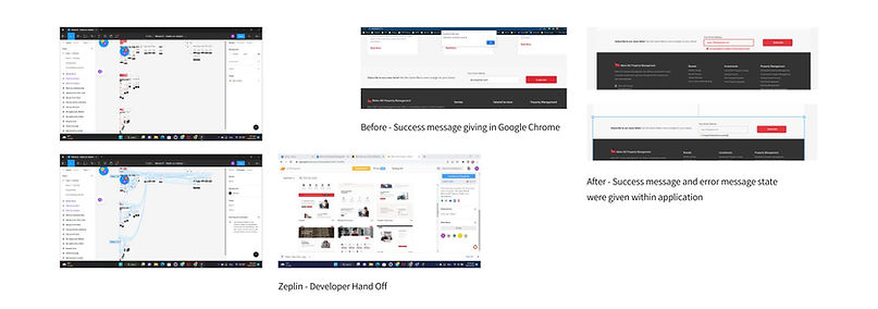
Developer Hand Off
I provided my design components before finalizing the high-fidelity designs. I delivered the mobile and desktop versions of my hi-fidelity screens, along with a clear prototype, and shared the static screens via Zeplin. I had effectively communicated the screen flows to my developers, resulting in minimal revisions needed. However, I did not anticipate some error states in my initial design. Upon reviewing the completed product from the developers, I identified an opportunity for a more intuitive message when unsubscribing, rather than using the standard Google Chrome message. I made the necessary adjustments and provided error and success state designs to the developers.
.jpg)
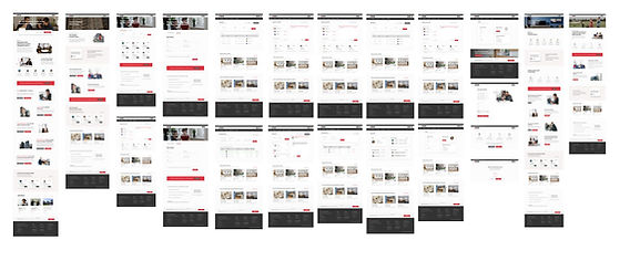
High Fidelity Screens - Desktop
I created high fidelity screens for Desktop, Tablet and Mobile viewports. For Desktop I created all static pages and My Account Portal's new users' and existing users' flows and an in-built message application (22 Screens). Width: 1440 px
.jpg)
High Fidelity Screens - Tablet
For tablet I created all static pages, login and My Applications and My Favorites screens for my account portal(10 screens). Width: 768 px
.jpg)
High Fidelity Screens - Mobile
For mobile I created all static pages, login and My Applications and My Favorites screens for my account portal(10 screens). Width: 375 px (iPhone)
.jpg)
Ideal Flow Chart
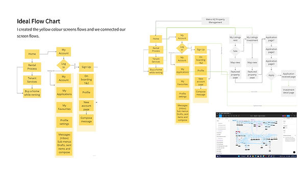.jpg)
Prototype
Some of my design rationales on this project
Usability Heuristics for User Interface Design
Throughout my User Interface design I carefully crafted all my design solution by considered the Jakob Nielsen's 10 general principles for interaction design. I explain few of my screens how I used this.
#1: Visibility of system status
.jpg)
The feedback was given to every user's action. Immediate feedback given using pop ups and the states were mentioned with more than 2 cues (for accessibility, I use more cues for avoiding differentiating only by colour).
#2: Match between system and the real world
The wordings made clear alike the familiar words they used. After testing, I refined more of these terms and made them clear to the users. Investments were changed to Property Investments to make it more clear.
#3: User control and freedom
The unhappy paths like withdrawing applications, unsaving the Favorites, saving the half-composed message in drafts were mentioned clearly at each stage. Even though these unhappy paths were given with less visual hierarchy to discourage the user to do that.
.jpg)
#4: Consistency and standards
The consistency is maintained all over the product by using reusable components, a style guide for (Heading, Sub-heading, paragraphs) and standards were followed, like other websites, like My Account login in the right corner and logo on the left corner, to reduce the cognitive load to learn something new
#5: Error prevention (Slips and Mistakes)
In forms, I added a functionality to give feedback to the password field while entering rather than after they submit the forms ( to avoid mistakes) and also added caps lock indication in passwords for avoiding slips (unintentional errors).
.jpg)
#6: Recognition rather than recall
I designed reusable components and reusable sections (wherever possible and) which follow the same functionality and maintain consistency to reduce the cognitive load and help people to recognize rather than recall.
#7: Flexibility and efficiency
The navigation is given for repeated and also for the novice user. By considering the repeated users, the search box given at the top and the FAB button to improve efficiency for both users. The details were given after the search box someone new to read the contents and also the sub heading links for the new user.
I designed every page by considering giving the most information on the first half to reduce scrolling for existing users and a detailed explanation on the second half for new users.
.jpg)
#8: Aesthetic and minimalist design
The information was given with lots of white spaces. The detailed information was given after the half page of information to give a concise look at the first half of every page.
#9: Help users recognize, diagnose, and recover from errors
The error messages were given to help the user to correct themselves while they are doing that particular action. For example, the password errors were given to users while entering rather than showing them after submitting the form.
.jpg)
#10: Help and documentation
The help text was given where it was needed. I gave the help text under the portal menu for new users to try to click the empty favorites or applications. I indicate that it is empty and also help them to understand what it is meant to be.
.jpg)