
Designing white labelled web experiences for therapists -
ACFB - (A NZ Health care startup)
Company: A Change For Better, NZ | Role: UX/UI Designer | Timeline: September - November 2022 | Tools: Adobe XD, Asana
Achievement: Delivered pixel-perfect high fidelity wire frames for three white labelled websites for therapists which can be easily customized for different requirements.
The Work: I was the sole UX/UI Designer and collaborated closely with CTO and CEO at ACFB, NZ to create high - fidelity wireframes using Adobe XD with good user and visual experience.
CEO's Endorsement: "Rameez has been helping A Change For Better for almost a year now. Her design style aligns well with our brand and she herself is a pleasure to work with. Rameez is always going over and above to ensure her clients are happy and we are!" - Ashley Cairns
Discover - UX Research
Before we started the project, we planned to create different therapist personas and empathies from their expectations. We created our first template for a therapist who offers narrative therapy for different types of psychological needs. Also, I carefully crafted the design without missing any of the user's needs.
In the Discovery phase I did,
-
Client Interview
-
User research
-
Setting Up Goals
Client Interview
My process started with client-interviews. My client is a psychology(mental health) counsellor who has experience in the counselling field for more than a decade, which helped me to understand about their customers(or potential clients). My questions were about the requirements they are looking for in the templates, their business objectives and what their customers are usually looking for or enquiring about in their clinic.
Our target audience of the websites place emphasis on the trustworthiness of the therapist. I set my primary goal to help them to connect with the therapist/counsellor and how the website can give most of the information they are looking for from the clinic and build trust between the counsellor and their clients.
Research and Goal Settings
I started analyzing the insights I got from the interviews and research. I also used some online forums and prototypical websites to understand the field and its potential customers. I organized my results and thoughts as follows.

From the problems / pain points, I started to find out my opportunities/goals, who the users are (and their priorities) and what my thoughts are on the website specifications that could help the business and their potential customers.

Define
In the Define phase I created,
-
Therapist Persona
-
User Persona
-
User Empathy Map
-
User Journey Mapping
which helped me to empathize with the user and create a product that could help them or satisfy most of their expectations or questions.
Creating Persona
My user persona was created with the needs in line with the benefits that my therapist persona offers. The persona is created with psychographic(personality) and demographic(personal information) information, current story, their goals and pain points.


User Empathy Map

User Journey Mapping (Current State)
The user journey mapping is created from the users' actions, what they are currently doing and their current situation. From my research I found some points, which people usually inquire in the clinic over the phone / by visiting before booking the session. By creating the user's journey within those pain points, I can find out some of the opportunities to help them without missing any crucial information. I empathized with the persona and created a mapping of how they think, act and say at every step of their current journey.

Ideate
The New User Journey (Future State)
From the opportunity we gained from the user journey mapping, I organized my ideas into a new user journey with a product that gives all the information that the persona needs. Thinking about how the persona reaches its goal, it also helps me to think about what the screens and sections are, that can be used in the new product.

Designing Information Architecture
The template 1 has 4 pages - Home Page, About the therapist, Services, Contact. It also includes blogs. We also created a blog listing page to use when the therapist uploads more than 3 blogs. The image below explains the information in each section and the navigation between the screens(sitemap).

The Paper Wireframes to Low Fidelity wireframes


Hi Fidelity Wireframes
The style of the product is designed with a simple monochromatic colour theme and simple typography as it can be customized for different brands. The mobile responsiveness is not designed as it is a white-labelled website. We can design when it is customized to any particular brand.

Design Handoff - Template1
The design has been delivered as a XD file which contains,
-
Hi Fidelity Wireframes
-
Style Guide
-
Built in Components
-
Interaction and design notes
-
Prototype
-
Animations(carousel, hover interactions)


Sample Product - Template1

Template 2
We created another client persona, and started working on the new website template2. We specified the client's different types of services - online counselling and selling online courses.
Website Goal: Creating a therapist website that offers the user to book their online counselling session and buy online courses for personal development.
The difference from the previous templates is that clients' different offerings - online shop and online counselling. I used the same user persona for this template and created different user journeys to structure the product.
I created,
-
Therapist Persona
-
Different User Journeys
-
Information Architecture / Structuring the product
-
Wireframes
Therapist Persona
I also added the pain points and needs from my previous persona to give all the relevant information to the users they look for on therapy websites. And I also changed the story to include a few points that match our website's goals.

User Journeys
I started creating different user journeys to ideate the structure of the product. I tried the following user journeys.
-
User Journey for buying the course
-
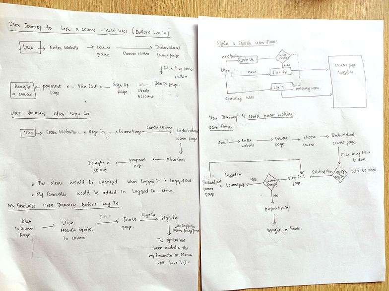
User Journey for buying the course - Before logging in
-
User Journey for buying the course - After logging in
-
User journey for adding courses into my favorites
-
Sign In Sign Up and Join Us page user flows

From the opportunity I ideated from the above user journey, I planned use the dynamic menu for the website that acts differently for signed in and before signed in states.
Information Architecture

Wireframes
As my client use Tutor LMS WordPress plugin for creating and building the online courses and e-commerce, I was not involved in admin side product design ( building and maintaining the courses). I was asked to design only the user-side pages (home, service, about, courses and sign-in & sign-up pages). I decided to use pink and peach colours as they mainly focused on women as their potential users. I also designed some sections for the user to understand how the online counselling and courses work and benefit the user.

Sample Prototype
I created a sample prototype with the few pages I created, for my client to show their clients the feel of the website.

Feedback, Improvements and Template3
The template1 was chosen by one of our clients, and we got some feedback on the design decisions from the real-time users. Even though it covers all the information the patient usually looks for and also the clients offer, our clients also felt it was overwhelmed with lots of text content.
I keep this in my mind when I plan to design this template and avoid those issues identified in the review of template1. I set this as my goal for the template3 and I used the same therapist and user persona for this template.
Problem: It needs to be concise and also give all the information in the minimal space. We also think about using a minimal or single colour for white-labelled websites to make it easier for customization.
Solution: I chose to use accordions in some places, to give the user to see the heading first in their first gaze and they can reveal and read the contents if they wish. And using illustrations and text instead of large text contents
Benefits: Accordions will reduce the cognitive load of the user to read everything or scroll for a longer time.


Sample Product - Template2

My Experience
It was an interesting journey to design white-labelled websites without any real-time requirements from business and users. I learnt to think from both user and business perspectives and design the products for different business needs.