
Designing new travel alarm app - Snooze - Design Thinking & Neumorphism UI Design
Role: UI/UX Designer | Personal Project | December 2021
The Challenge: While I was looking for a new UX challenge to sharpen my thinking, I found this in "uxchallenge.co/" , "Wake up, this is your stop" Have you ever tried to take a short nap on the train only to wake up and find yourself at the end of the line? How can you help passengers wake up just before the train arrives at their station?
So, I set out to empathize and organize the design process and challenge myself to tackle a UX problem in a minimal time, in order to show how I think of solving the problem.
Discover
What do people think about this problem?
Research : I thought of the current options in hand. I spoke to couple of my friends and also researched in google and online forums on how people handle this situation and found some key insights of user's feelings. My quest was based on the three following questions,

Empathize with the user : Analyzing Insights
I created empathy map by organizing the key insights of my research to understand what they think, say, do and feel.

Define
I categorized the users into three groups - Office goers, travellers and students. The medium of transport would be a bus or a train. I created my persona, Sam from one of this category to understand the goals, pain points and his feeling about his problems and relate to it. I thought about how he might react to a particular situation.
User Persona :

Thinking about current solution : Currently, the solution is setting up an alarm on mobile so that we can sleep. Will it really work ? If we get stuck in traffic can we assume the correct duration to set an alarm? These questions helped me to arrive at a conclusion that we cannot use time as a factor for the solution.
I also thought of another option, i.e. avoid sleeping and concentrating on something. Can we really concentrate on reading or listening to something while riding a bus or train? The mind is always stuck about the stop and concerned about missing it. I always believe in living in the present. I set my goal to give users the solution that makes them enjoy the moment.
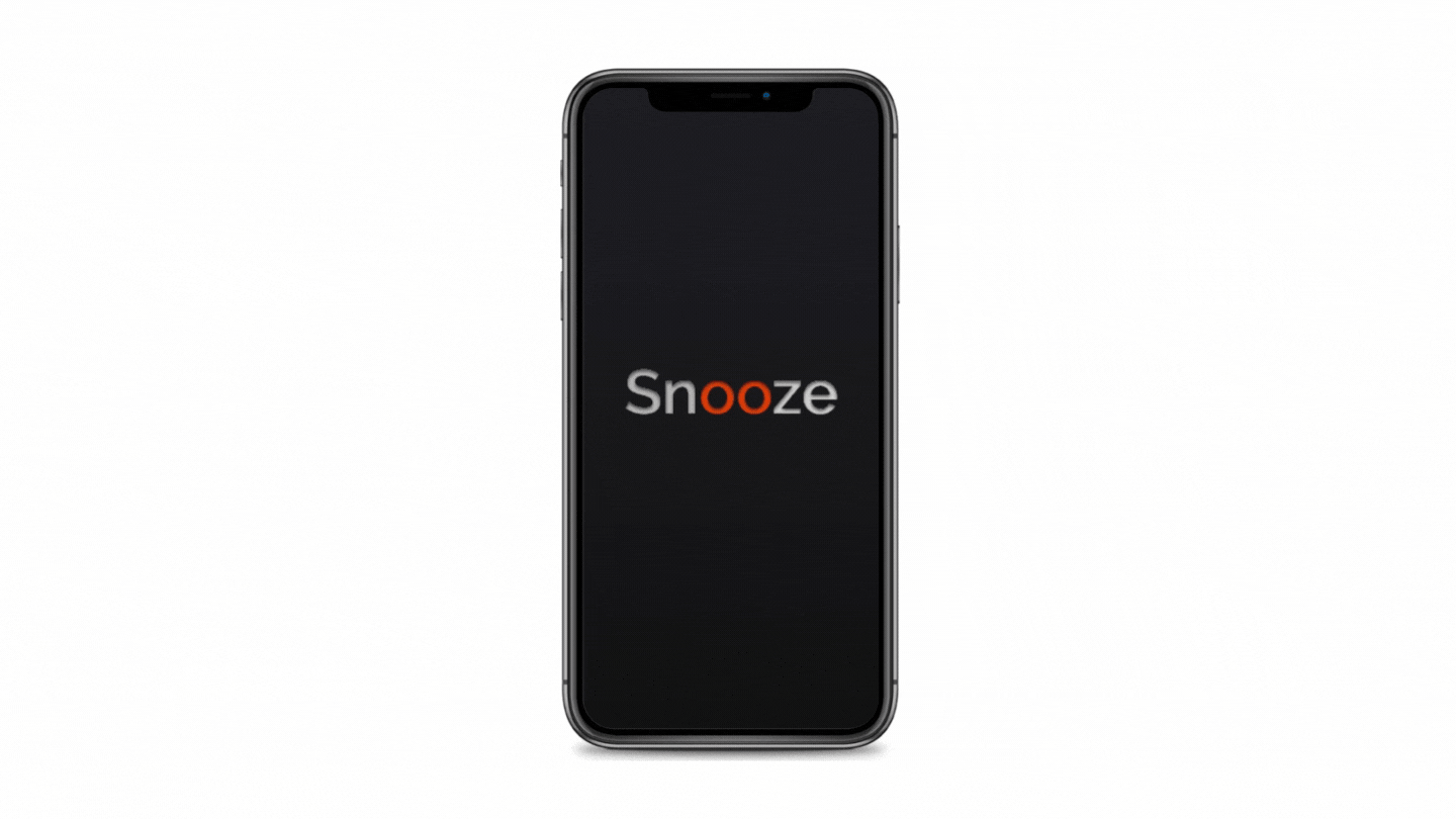
Get a peaceful snooze until you reach the stop! And that's how I got a name for the app, Snooze !
Ideate
The Problem Statement
The problem statement : "The user misses the stop due to their tiredness while they are traveling. They need to wake up before their stop arrives."
The solution could be : Creating an app with an alarm. If the alarm rings just few mins before he reaches his destination, it will let him sleep peacefully.
Ideas- Why time is not a factor?
What would be a factor in setting the alarm? I think about time and radius. But thinking about the user's journey with a scenario and these factors gave me a clear picture of what I should choose.
Scenario : The duration of the journey is 30 minutes and the distance is 6 km. In the middle of the journey(3 km to the destination), the bus gets stuck in traffic for 30 minutes.
When time is an alarm factor : The user set the alarm 5 minutes before the destination. But the bus was stuck in traffic for about 15 minutes. The alarm rings when he is in traffic and he doesn't know when he will reach the destination. His sleep is interrupted.
When radius is an alarm factor : The user set the alarm 500m before the destination. The alarm rings only when the bus is 500m from the destination. His sleep is not interrupted even when the bus is stuck in traffic.
The User Flow
I started thinking about the steps involved in the solution. The main goal of the project is a simple-to-use app that has very few steps to achieve the goal.
* I thought saving the regular destinations would save the user from selecting or finding the place on the map. So I decided to give options on screens to help the user to save their destinations.
* Giving a default radius will reduce the user from typing or choosing the radius.
* Done! At only 3 clicks, the user can set the alarm :)
The basic wireframes and paper sketches were used to ideate my thinking on each screen.
Screens
1. Welcome Screen
2.Sign In screen
3.Destination Screen
4.Radius setting screen
5.Map for the current location
6.Alarm screen

The Information Architecture : To improve the usability, I gave the user freedom to move between screens at any time. They can change destination or radius or switching on or off the alarm at any stage and with simple clicks.

The UI Design - What is new ?
To avoid eye strain (because the user is tired), I decided to use a dark-theme UI design. The colours used in the app are checked for color contrast(4.5 : 1) for better accessibility.
Neumorphism : A new design trend whose aesthetic is marked by minimal and real-looking UI. The inner and outer shadows are defined to maintain UX consistency,
Screens - Hi Fidelity WireFrames


Proposed Solution

Sample Product
Learnings
I designed this app to understand how to empathize and organize the design process and challenge myself to tackle a UX problem in a minimal time. Throughout this journey, I learnt more about working with dark themes and shadows.
Thanks for Scrolling!