
Designing new insurance buying experience - UX Research and Design - Turners Cars
Role: Agile UX Designer | Timeline: November - December 2022 (1 month) | Tools: Figma, Miro, Azure DevOps, Trello, FigJam and Teams | Agile Methodologies: Scrum
The work: Turners Cars was another project during my Agile UX Design Certification with Mission Ready HQ, Auckland. Here I got an opportunity to deep dive into the different design phases to create a new experience for Turners. This is a group project. While my team mate designed the static pages I designed the buying experiences' online quotation feature.
The Challenge: Turners is currently undertaking a major re-design of its motor vehicle insurance systems and processes, including an investigation of ways in which the introduction of new technologies can enhance the buyer experience. I was given an assignment to work on this project to help create a new insurance buying experience.
Team mate's Endorsement: "Rameez is an exceptional professional with a unique combination of technical skills, business acumen, and a strong work ethic. In my time collaborating with Rameez on this project, I have seen firsthand her ability to manage complex projects, meet tight deadlines, and work effectively with a team. Rameez attention to detail and commitment to quality were evident in every aspect of her work, to ensure the project's success.
Rameez consistently demonstrates a deep understanding of UX Design and has made significant contributions to our team's success. Her innovative ideas and problem-solving skills have helped drive projects forward and have earned them the respect of colleagues and clients alike. I would not hesitate to recommend Rameez for any project or opportunity in the future. Rameez is a highly skilled and dedicated professional who always goes above and beyond to deliver outstanding results." - Rachel Foo, UX Designer
The Process
I applied a double-diamond design thinking process in this project. And I used various research methods and Agile UX Design industry practices throughout the project. I also got an opportunity to team up with other student design teams(Chapters) and student full stock developers(Squads).
Discover - UX Research
Week 1

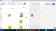
Stake Holders Mapping
My project started with the stake holder mapping to get a visual representation of all the people who can influence the project and how they are connected. I mapped the internal stake holders, external stakeholders and their power and influence on the project.
.jpg)
Understanding Context of the project and preparing user interview questions
Before meeting the student design team, I worked on understanding the context of the project and also prepared questions from different perspectives for the Turners customer and the business person.
.png)


Week 2
This week we applied a design thinking process to a solution. In this ideation phase, I also worked together with a student UX team mate and had an ideation session with student Software Developers.
.png)
Customer and Business Staff Interviews
In the customer interview: I was in the first group called "Business and Operations". We dropped all our questions to the board. Our PO created some categories and we all collaborated and chose the best questions from all of us and organized them into the appropriate categories. Then we discussed and chose the priorities and the set of questions to be asked in a customer interview.
Collaboration Tools: Figjam and Teams
.png)
Empathy Maps : Analyzing Insights
During the interviews (version1) I created the empathy map to understand what they think, say, do and hear. After the interview, I organized the details and created version2 empathy map for customer and business staff interviews.
Venn Diagram
Then I worked with my design mate and created the Venn Diagram to find out the shared problem between the business and the customer. We chose this method to understand what are the immediate problems to be solved. Collaboration Tools: Miro and Teams

Discovering Problem Groups
Then we grouped the mutually related problems. We found two problem groups to solve. I chose to create an online quotation and insurance buying experience.
.png)
Define
Ideal Customer Journey Mapping
My design-mate and I defined an ideal customer journey mapping to understand what the future product would look like and find the opportunities to improve the product.
.jpg)
.png)
Problems I chose to solve
I chose to create an online quotation and a new insurance buying experience. I worked individually on this problem solving stage. Even though we also gave a frequent peer review (with my design team-mate) to each others ideas to refine our designs.
Persona
I created the persona from the information I got from the customer interview. I defined my persona's, pain points, goals, preferences and behaviors while buying insurance. I only considered it from a user perspective as we planned to create a customer faced screens. But also, we thought from a business perspectives in our Ideal Customer Journey Mapping to understand what the opportunities we could improve in our future product and business.
.png)
Problem Statement
I tried to answer the following questions and it helped me to create my clear problem statements.
Who is affected by the problem? - Customer who wants to buy Turners Insurance
What is the problem? - Need to wait for getting quotes that delays or discourages buying insurance
Where does this problem occur? - In Turners Insurance Dept
When does the problem occur? - While buying Insurance
Why does the problem occur? Why is the problem important? - It requires more manual activities that makes the user wait for quotes and this waiting time may change the users' decision that may prevent them from buying
“The process of getting quotes takes a long time and that requires manual activities. This means sales often take a long time to close. There’s an opportunity to get the quotes easier and quicker with possible benefits that might help the customer to make the decision to purchase and, thus, it improves sales in the insurance dept.”
Competitors Research
Before I started solving the problem, I did competitor's research to find out how they solve this particular problem and where they missed their experience to understand the opportunities I could add to my solutions.
For example, on AA Insurance, they use the tab cards for monthly and yearly quotes which actually hides the other one's benefits. I designed two cards visible all the time to show the benefits without hiding anything.


Agile Project Management
I solved these problems by following Agile methodologies. We used the ADO board to track our process and we had everyday stand-ups to keep in track of each others work.
.png)
Week 3
For this week, I worked individually on a part of the product that I shared with my UX design team mate and we also met everyday for standups and discussed about the blockers we went through. We also met the student software developers from our team to understand the technical feasibility of our solutions.
.jpg)
User Stories and Tasks
I created three user stories and their sub tasks under my problem statements. I created the task flow for each task, then I merged them as a single user flow. This helped me to create the design/solution more detailed.

Develop
User Stories, Acceptance Criteria, DOD and Task Flows


Interaction Design
During my design interaction, I mentioned all the focal points first. From there, I created the possible flow on each journey. Here is an example of my interaction designs on getting online quotation and buying insurance.
.jpg)
Complete User Flow
.jpg)
User Journey Mapping for Kyla (persona) and proposed flow
Once I completed the complete user flow, I fit Kyla in that journey to check the flow and find opportunities that I could improve in the solutions.
.jpg)
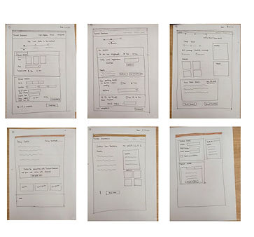
My Sketches
.jpg)
Some of my sketches on quotation and buying experience pages.
Wire Frames - Figma
.png)
Accessible UI Design
As forms need to be more accessible and have many interactions with customers, I carefully crafted the form UI.
-
The brand colors and text were used from the original brand, and UI element states were differentiated not only by colors but also with additional properties like text strength.
-
The placeholder text, button labels, error and success messages (microcopies of UX writing) were written in easy-to-understand language to improve accessibility.
-
Progress bars were given more details, which even work well in grayscale.
-
Color contrast was checked to ensure a ratio of 4.5:1 for information bearing elements and 3:1 for UI controls, adhering to WCAG 2.2 guidelines.
-
Negative spaces were used effectively to group related content and aid understanding.
.jpg)
.jpg)
Deliver
Week4

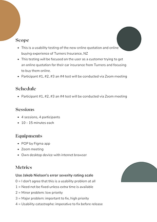
Usability Test Plan
.png)
.png)
.png)
.jpg)
I created the usability test plans for all my user story goals and tested them whether it achieve the definition of done.
Conducting Testing
My design-mate and I conducted the testing together. We tested 4 users. I created 4 tasks for the usability test on the online quotation and online buying experience. The first 2 tasks are for the first user story and the remaining for the next two user stories. I carefully write all the tasks that should lead the user to the journey what is meant to be definition of done. We also create some debriefing questions to ask at the end of the testing.
-
Tell me about your experience of completing this task.
-
What you like and don't like and why?
-
If you had 3 magic wishes to improve this product, what would you change?
All our testing are done remotely. Then I documented the users' observations and created the Neilson Norman's severity rating. And then I prioritize the iterations that have to be done immediately.
.jpg)
User Observations
.jpg)
.jpg)
.jpg)
.jpg)
NN Usability Testing Severity Report
.jpg)
Some of the catastrophes I found during the testing.
-
The users found it hard to go back to when they were in the different stages of the process. I used proper back buttons to easily navigate around and also gave the option to go back using the process bar.
-
The quotation card doesn't grab user attention. So they missed the upselling opportunities too. I used the higher contrast color to improve the visual hierarchy.
The Solution - High Fidelity Figma Screens


The Solution - Figma Prototype
Developer Hand Off
I handed over my screens in Figma and also gave the files in Zeplin to the student developers. I also created and handed over a style guide for the screens I designed.
.jpg)
.jpg)
.jpg)
.png)
Learnings
-
I got good experience of conducting interviews and usability tests on this project. It was surprising to see different user perspectives during the testing.
-
It was a wonderful experience to collaborate with design teams and the developers.
-
I improved more skills in Figma and learnt new tools like ADO boards and Zeplin.